Oberoi Hotel
An experiment in Luxury
Overview
Sohraab Walia
Swapan Seth
Kabeer Walia
Saahil Khan
Timeline
Team
6 months
My Role
UX Design — Visual Design, User Research, User Flows, Rapid
Prototyping, Digital Marketing
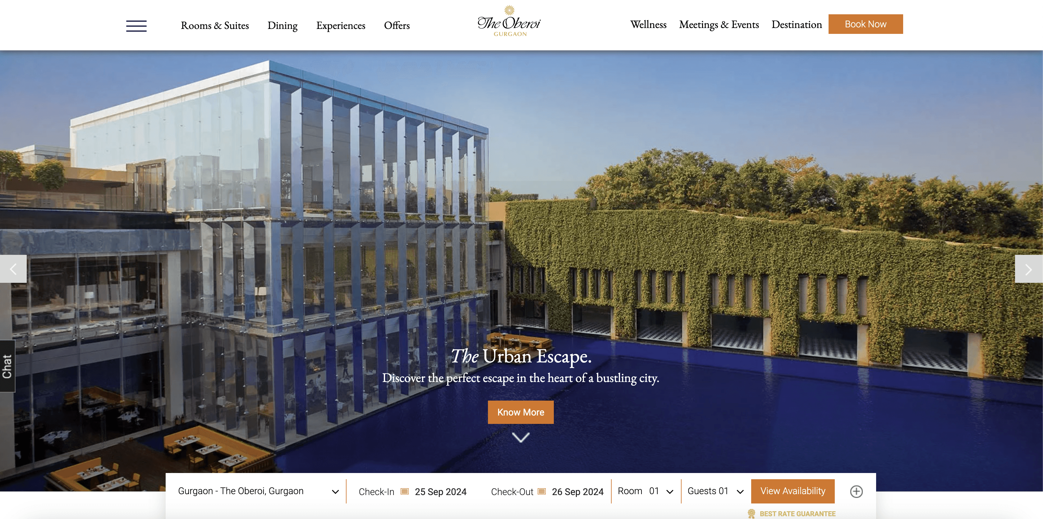
The Oberoi Group is a leading luxury hotel brand known for its impeccable service and unique blend of Indian warmth and modern design, offering unforgettable experiences across its global properties.
The Oberoi Gurugram website redesign was an exciting project aimed at creating a digital experience that reflects the brand’s luxury ethos.
The design focused on intuitive navigation, visual storytelling, and an effortless booking process to engage users and convey the exclusivity of the property.
Consistency across properties
Design system
solving complexity
As Oberoi Hotels' primary brand color is orange, we made adjustments to ensure the website meets AA compliance for accessibility, given the diverse audience it serves. Specifically, white text on the orange background now has a font weight of medium and a minimum size of 15pt to ensure proper readability.
This change introduced challenges in the design process, particularly with responsive layouts, where maintaining consistent sizing while working within the design grid posed difficulties.
To ensure a cohesive brand experience across all Oberoi Hotels websites, we worked closely to develop a design system that would serve all their websites. This involved maintaining consistency in visual elements, typography, and layout across various properties while allowing each hotel, including Oberoi Gurugram, to retain unique features that highlight its specific offerings.
Typography
Title/Header 1
Family: EB Garamond
Weight: Bold
Size: 64px
Letter Spacing: -2%
Title/Header 1
Header 2
Family: EB Garamond
Weight: Bold
Size: 40px
Letter Spacing: -2%
Header 2
Header 3
Family: EB Garamond
Weight: Bold
Size: 24px
Letter Spacing: -2%
Header 3
Subtitle/Body Large
Family: EB Garamond
Weight: Medium
Size: 24px
Subtitle
Body
Family: Roboto
Weight: Medium
Size: 16px
Line Height: 140%
Body
Bold
Font Weight: Bold
Body
Small
Family: Robto
Weight: Medium
Size: 14px
Smaller text here
Pre Title
Family: Robto
Weight: Bold
Size: 10px
Letter Spacing: 3%
Pre title
Button Text
Family: Roboto
Weight: Bold
Size: 10px
Letter Spacing: 3%
Button Text
Link
Family: Roboto
Weight: Bold
Size: 16px
Decoration: Underline
Link Text
Colors
Tiger orange
#d8741b
CTAs
Focused/Active states
Primary Brand
FUSCHIA
#d9bf60
Secondary button, Highlights
Secondary Brand
Sky blue
#F3D9DA
Accenting
Illustrations
Tertiary Brand
ONYX
#0E0E2C
Overlays
Shadows
Headings
Dark
SLATE
#4A4A68
Body text
Text
LIGHT SLATE
#8C8CA1
Helper text
Deemphasized text
Subtle Text
CLOUD
#FAFCFE
Light mode backgrounds
Light mode Dialogs/alerts
Light


A deep dive into the customer's perspective
The current user journey
Research
Our research revealed key pain points in the user journey, such as overwhelming navigation and a lengthy checkout process.


The ideal user journey
The website's experience is not optimized for mobile, which is a critical gap given that India’s economy is mobile-first, with the majority of hotel bookings made through mobile devices.
Industry data reveals that hotel booking abandonment is a common issue, with complex checkout processes and unclear calls to action being major contributors to user drop-offs.
Key pain points
Industry insights
Amongst mobile users, largely due to poor mobile optimization.
85% abandonment rate
In India are made on through mobile devices.
40% of all bookings
90% of website visitors
browse without taking any action, primarily because of confusing layouts and unclear CTAs
Lengthy Booking Process
Multiple steps and inconsistent CTAs cause frustration, leading users to abandon their bookings.
Complex Navigation
Users often struggle to find information quickly due to overwhelming menu options and scattered content.
Unoptimized Mobile Experience
The site’s lack of mobile optimization results in a poor user experience and reduced conversion rates.
A deep dive into the customer's perspective
Research
Our research revealed key pain points in the user journey, such as overwhelming navigation and a lengthy checkout process.
A deep dive into the customer's perspective
Research
Our research revealed key pain points in the user journey, such as overwhelming navigation and a lengthy checkout process.